Friday 4 May 2007

Yoshitaka Amano - Illustrator

Yoshitaka Amano
One of my favourite illustrators of all time. I first discovered his work when i bought a video game, Final Fantasy for the playstation. Being a huge final fantasy fan i researched his work a long time ago.


This website is tells you everything you need to know about him.


He's also done work for Neil Gaiman the sandman and Vampire Hunter D


This is some of his Final Fantasy work


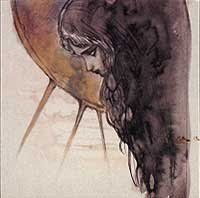
Some of his other work


Japanese Blythe Dolls & Gina Garan photography

Gina Garan

A lover of Blythe dolls and an offical photographer of them. She reintroduced the world of blythe.
Ginas photos are now collectables as aswell are the dolls. I own a blythe doll myself and tried to take photographs.
Im quite proud of this!

http://www.thisisblythe.com/


Manufactured by Kenner in 1972, the original Blythe was designed by Marvin Glass & Associates, one of the world's foremost toy design studios. When the Toy Industry Hall of Fame was established in 1984, Marvin Glass was in the first group inducted (which coincidently also included Merrrill L. Hassenfeld of Hasbro, Inc.), ten years after his death. Kenner was bought out by Tonka Toys, which in turn was bought out by Hasbro in the mid-1980s. And that is how Hasbro has come to own the Blythe property.

Vintage Blythe advertisement
Then and now.
In 1972, children found the large eyes that changed from green to pink to blue to orange with the pull of the drawstring at the back of Blythe's head a bit on the scary side. Blythe was produced for only one year, but it is now apparent that she was ahead of her time. For many years, Blythe was a curiosity that only doll collectors were interested in. Then in 1997, a friend introduced Gina Garan to Blythe, thinking that Gina looked like the doll. Gina had just been given an old camera and she needed to test it. Her first photos using that camera were of Blythe. Gina, who works as a video and TV producer, started carrying at least one of her Blythes wherever she went on her travels around the world and took many photos.In December 1999, at the opening of an exhibition for the
CWC International artists in Soho, New York, Gina showed her photos to Junko Wong. Junko took these photos to Parco and made a presentation for an exhibition and as a "virtual model" for Parco's innovative sales promotions. In the summer of 2000, This is Blythe, photos by Gina Garan, was published by Chronicle Books. The Christmas 2000 Parco campaign featured Blythe in a TV commercial and print media and Blythe took off in Japan. On eBay, vintage Blythes jumped in price from $35 to $350. Blythe continued as Parco's "image girl" through the spring and into the summer of 2001. The price for vintage Blythes jumped to thousands of dollars U.S. on eBay. Even the Neo-Blythes are sold for up to four times their retail price on the Yahoo auction site in Japan.In June 2001, the first of the Neo-Blythes - produced by CWC and manufactured by Takara - went on the market. The launch of the neo-Blythes was in conjunction with a photo exhibition by Gina Garan. Gina made the trip from New York for the launch and exhibition

The Parco Limited Edition (1000 dolls), sold out in less than an hour, was followed by the Mondrian, and then Rosie Red, Holly Wood, All Gold In One, Kozy Kape Inspired, Aztec Arrival Inspired, Sunday Best, and in conjunction with the first year anniversary of the neo-Blythes in Japan, Miss Anniversary Blythe. The first year anniversary was marked by a series of Blythe events in Tokyo, which included an exhibition and charity fashion show at the Spiral Hall in Aoyama and exhibitions at the Rocket and CWC Galleries, and at IMS in Fukuoka, Kyushu. The exhibition featured photos by Gina Garan and dolls styled by artists, fashion designers, and Blythe fans. The fashion show featured couture for Blythe by such internationally known designers as: Issey Miyake, Chisato Tsumori, and Hysteric Glamour


Tuesday 1 May 2007

Type designers and type faces

Doing my research i came across a website that listed a vast amount of typographers and it helped me alot. Its a simple site not very elegant but i found it useful.
My fonts.

Josef Albers (1888-1976)

German artist, designer and educator. He developed theories relating to the forms of colour, line and geometric.

Albers ideas are in a book he published called Interaction of colour

He also produced some typefaces.

Adrian Frutiger

A well known typeface designer, he experimented with a variety of self-invented scripts and stylized handwriting in reaction to the formal cursive required at the time in Swiss schools.

Click here to see more.

List of type faces designed:

President
Meridien

Egyptienne
Univers
Serifa
OCR-B
Iridium
Frutiger
Glypha
Icone

Breughel
Versailles
Avenir
Vectora
Didot (Linotype)


Giambattista Bodoni (1740-1813)

'Giambattista Bodoni achieved an unprecedented level of technical refinement, allowing him to faithfully reproduce letterforms with very thin "hairlines", standing in sharp contrast to the thicker lines constituting the main stems of the characters. His printing reflected an aesthetic of plain, unadorned style, combined with purity of materials' - wikipedia

Bodoni type family


Roger Excoffon (1910-83)

French self taugh typeface designer. Produced a numerous amount of posters combined with typography.


Antique Olive
Antique Olive (URW)
ITC Banco
ITC Banco Light
Choc
Choc (URW)
Choc Light
Mistral
Mistral (URW)
ITC Mistral Light
MN Olive
Staccato 222

Akidenz Grotesk

Akzidenz Grotesk is a realist
sans-serif typeface originally released by the H. Berthold AG type foundry in 1896. Contemporary versions of Akzidenz Grotesk descend from an early-1950s project, directed by Günter Gerhard Lange at Berthold, to enlarge the typeface family, adding a larger character set, but retaining all of the idiosyncrasies of the 1896 face. Some new weights, condensed and extended widths were released under the title Standard. While Günter Gerhard Lange sought to academically retain Akzidenz Grotesk's imperfections, Max Miedinger's 1957 Swiss typeface Helvetica, used it as a model but sought to refine the typeface making it more even and unified. Akzidenz Grotesk also influenced Adrian Frutiger's 1956 typeface Univers. Akzidenz Grotesk is the first sans serif typeface to be widely used.

Click here to see sample

Futura

Futura is the fully developed prototype of the twentieth century Geometric Sanserif. The form is ancient, Greek capitals being inscribed by the Cretans twenty-five hundred years ago at the time of Pythagoras in the Gortyn Code, by the Imperial Romans, notably in the tomb of the Scipios, by classical revival architects in eighteenth century London, which formed the basis for Caslon's first sanserif typeface in 1817. Some aspects of the Geometric sanserif survived in the flood of Gothics that followed, particularly in the work of Vincent Figgins. In 1927, stimulated by the Bauhaus experiments in geometric form and the Ludwig & Mayer typeface Erbar, Paul Renner sketched a set of Bauhaus forms; working from these, the professional letter design office at Bauer reinvented the sanserif based on strokes of even weight, perfect circles and isosceles triangles and brought the Universal Alphabet and Erbar to their definitive typographic form. Futura became the most popular sanserif of the middle years of the twentieth century. Ironically, given its generic past, Futura is the only typeface to have been granted registration under copyright as an original work of art, and, further irony, given the key part played by the Bauer letter design office, the full copyright belongs to Renner and his heirs. This decision in a Frankfurt court implies that a further small group of older typefaces may also be covered by copyright in Germany, particularly those designed for Stempel by Hermann Zapf. This situation appears to be limited to this small group of faces in this one country, although protection of designers' rights in newer typefaces is now possible in France and Germany through legislation deriving from the 1973 Vienna Treaty for the protection of typefaces. Mergenthaler's Spartan is a close copy of Futura; Ludlow's Tempo is less close. Functional yet friendly, logical yet not overintellectual, German yet anti-Nazi... with hindsight the choice of Futura as Volkswagen's ad font since the 1960s looks inevitable.

I'll admit this text is stolen but i liked it so i wanted to include it in my blog.


see here for the website

Im going to continue to edit this mind so its no where near finished


Monday 30 April 2007

My favourite Group of illustrators


Heres the thing. I love anime and all kinds i appreciate it in all its form and glory. It is my passion and you cant put me down for it just because you dont like it. Ive been studying a certain all female group of illustrators since i was about 15. A group called Clamp


I bought this book when i went to London a couple of months ago and its amazing.